LOGOS & BRANDING
While I’m expanding upon my logos & branding work, here are some examples of my work so far.
My Approach to Design
Please note that I am working to expand my portfolio and experience!
I prefer a more hands-involved approach to design, so if you’re looking for a more ‘hand drawn’ look – then I might be the perfect fit to design your logo. This is because I am an artist at heart, and I will always take the hard route to design work!
My portfolio of art, and lots of the graphics that I have made over the years, might give you a good idea of the aesthetics that I automatically lean towards:
- Cute & cozy,
- German expressionism,
- ‘Organic’, intentionally avoiding straight lines & uniformity,
- Preferring to hand-write text & titles rather than use any specific font.
Transmuted CIC is a community interest company for trans people ran by myself & now a growing team of virtuous volunteers, this is the first logo design I ever attempted – back in 2022!
The logo symbolises a megaphone, using our platform to be heard, the ‘TM’ incorporated within the megaphone. The ‘M’ represents a hand, whilst the ‘T’ represents absolutely nothing apart from looking very cute.
(A CIC, very basically, is a non-profit that tries to make money for the community like a company would for itself.)
While some of these graphics are more outdated than my most recent designs, I think they are now quintessential reflections of the CIC. It’s funny how a hurried design, made on a whim, can really stick with a company, its organisers, and its audience!
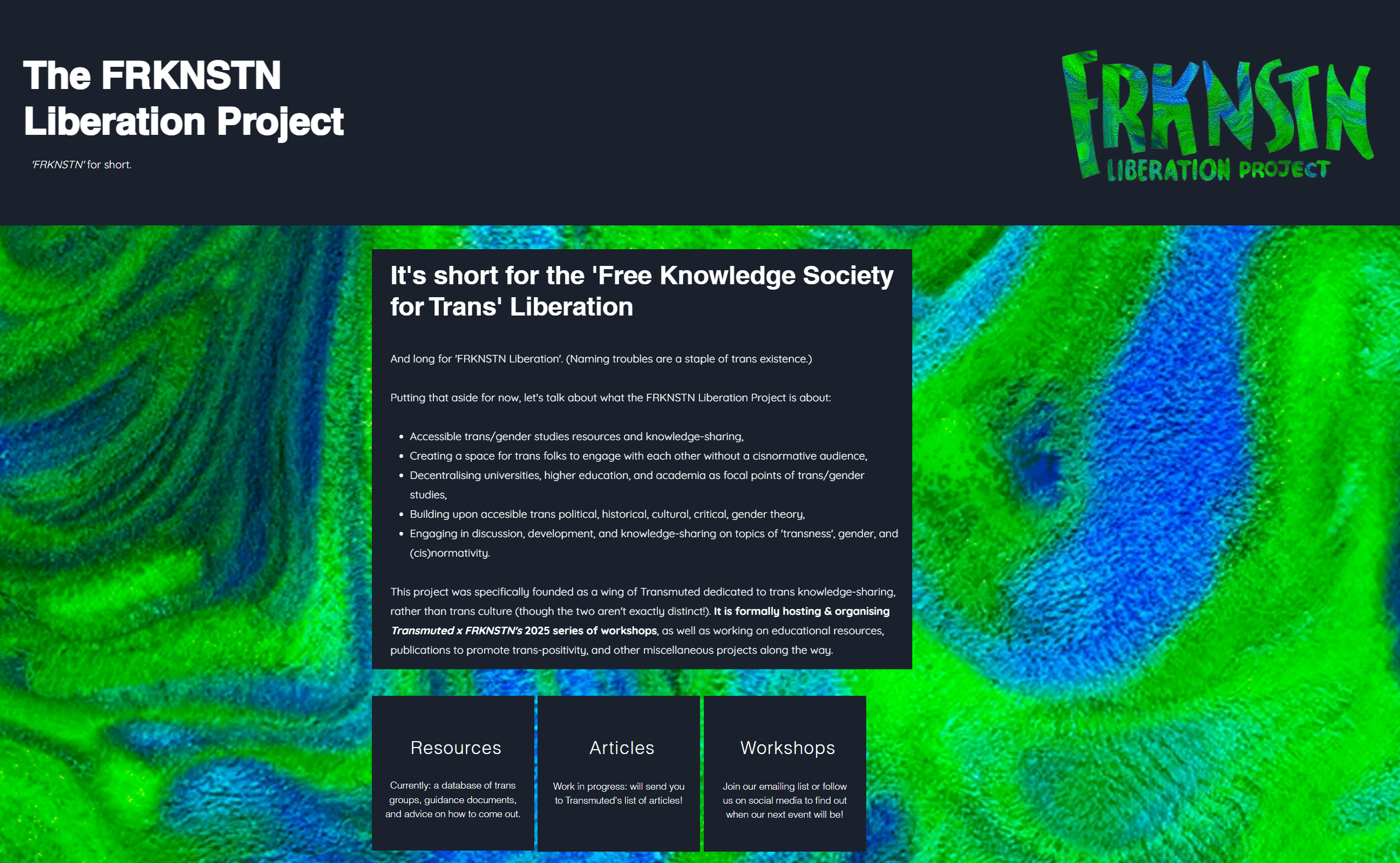
The FRKNSTN Liberation Project is a ‘free university’ style project purposed to spread trans-positive and well-researched information, knowledge, and study to those who would otherwise not have access to it.
We do online workshops, occasional in-real-life events, work in our own time to research and write upon under-covered topics, create free resources, and work towards the liberation of trans people from transphobic ignorance (among other things).
You can find out more here.
Transmuted CIC currently helps to run the project as we attempt to grow and find our feet – so if you like what you hear, consider supporting us by sharing the project or donating.
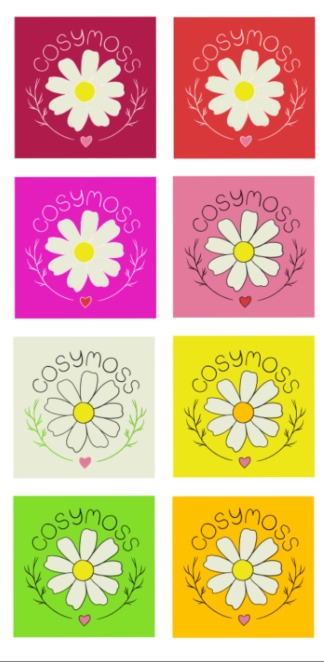
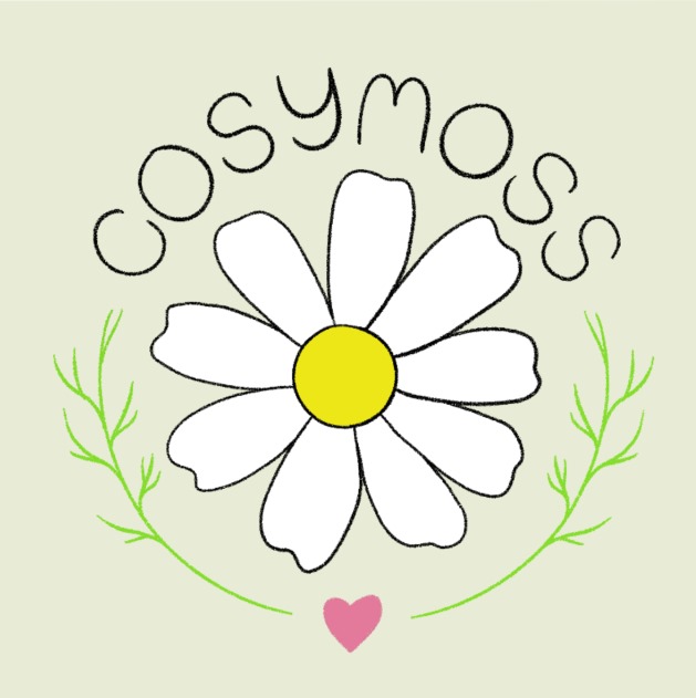
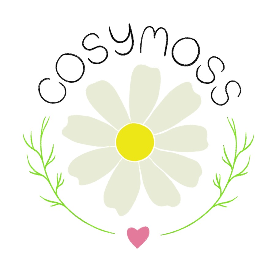
Cosymoss is a craft business ran by a hobbyist-turned-small business owner who is still developing their practice, but gave me permission to share the logo design I made for them!
Having a logo and a basic framework for your side hustle can really help motivate you to move forward, and especially to take yourself seriously – and if you’re like me, that’s something you seriously struggle with.
Sometimes it is nicer to get someone else to design things for you, rather than use your own designs, as an outside perspective can really help you develop your ideas and even your confidence!

J. R. Thompson & Sons is a quaint arable and pastoral farm in North Yorkshire, for whom I was lucky enough to practice my logo design skills!
Shown is a circular design with the company name underneath in a ‘reverse rainbow’, with vector art of a sheep’s head and rolling hills behind.
